A minimalist approach to the subject.
Part of the Enter the Brick series.
– Gallery –
[Best_Wordpress_Gallery id=”21″ gal_title=”Upside Down”]

A minimalist approach to the subject.
Part of the Enter the Brick series.
[Best_Wordpress_Gallery id=”21″ gal_title=”Upside Down”]

Although there is a bunch of new Enter the Brick creations in the pipeline, I find myself dabbling in experimental fields outside the plastic.
When rebooting the Enter the Brick Series in the beginning of 2016 (when I was finally able to make some decent photos technically) I showcased a digital edit of a brick.
What attracts me about this possibility is the create something impossible IRL. This extends the possibilities exponentially.
Recently I also made a few paper sculptures (more at the below gallery).
And now in the heat of the summer I made this brick out of ice by making a DIY mold based upon the upscaled brick.
There are a few ideas in my mind which spin off from these directions but for now this is it until I feel like coming back.
[Best_Wordpress_Gallery id=”20″ gal_title=”Enter the Brick – Experimental Excursions”]
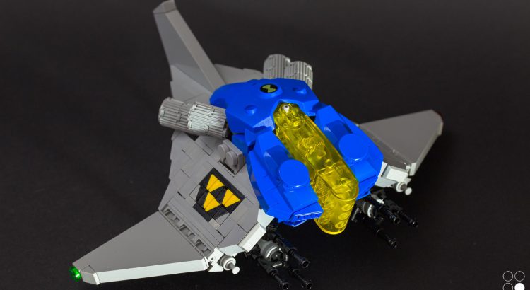
Spaceships are an interesting subject. They are rooted in the known world, consisting of elements from real life space excursions like thrusters, wings, a cockpit and such. Beyond this boilerplate the imagination can go wild as while the mind is in space anything can be imagined and turned into the vibe of space traveling. Especially otherworldly imaginary defies our conditioned perception.
For me spaceships have the above described potential, ranging from model building to abstract art. This indefinite shift makes this genre so interesting. On a pragmatic level building spaceships also flex the brick muscles.
When building something new or even in a classical genre I mostly try to adapt at least one twist, like incorporating special parts, applying a distinct paint job, conversing a certain style or design, including a trick like hidden mechanics or expressing some kind of statement. Sometimes I even manage a blend some of them into one creation.
There is a fixed design in the Lego world called NCS – ‘Neo Classic Space‘ – with the set colours light grey and blue around a transparent yellow cockpit section; alongside small bits of black and a yellow-black-yellow striped flag as marking. The NCS design is adapted from the first range of space sets released by Lego in the late eighties. This group of space explorers can be described as neutral. Short after there were different factions invented by Lego. The second wave of Classic Space included a bad guys faction which shifted the classic space guys to ‘good’ respectively. The bad boys faction was called ‘Blacktron‘. Their faction colours were black with transparent yellow cockpits and their marking consisted also of yellow and black, but the design was different. Blacktron used three downwarded yellow triangles forming a larger triangle on black ground instead.
The pre-story is necessary for understanding the hidden dialogue in this build if you are not accustomed with the Lego space themes. The abbreviation NCBS stands for ‘Neo Classic Blacktron Space’ and the Spaceship’s name ‘High Jack’ should be obvious.
[Best_Wordpress_Gallery id=”19″ gal_title=”NCBS_High Jack”]
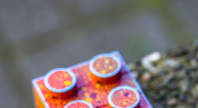
One of the few brick related publications which has a broad perspective sophistically ranging beyond the bricks is the UK based BricksCulture magazine.
Actually I am writing an article series about bricks and street art, starting with the first article in the just released issue 6. I was even lucky to have a front page feature :-). I am stoked since this is also my first written and published article.
If this is up your alley and you’d like to know more about this topic, I’d strongly recommend you to pick up a copy.
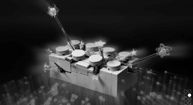
One of the larger projects I am currently working on is reshooting the Enter the Brick series.
This includes better shots and new perspectives alongside staged and edited photographies.
For starters here is the Punk Funk disco edit:
Notes on the image processing
The backdrop was glossy black cardboard. The lighting was a mix of tabletop lamps and a colour change mood lamp with glass-fibre optics. For this image I made two photos, one with and one without the fibre-optics. While shooting the one with the glass-fibre optics I played with the focus of the camera lense, creating a blurry effect falling into the center. Then after some post processing the two pictures were merged into the above shown final image.
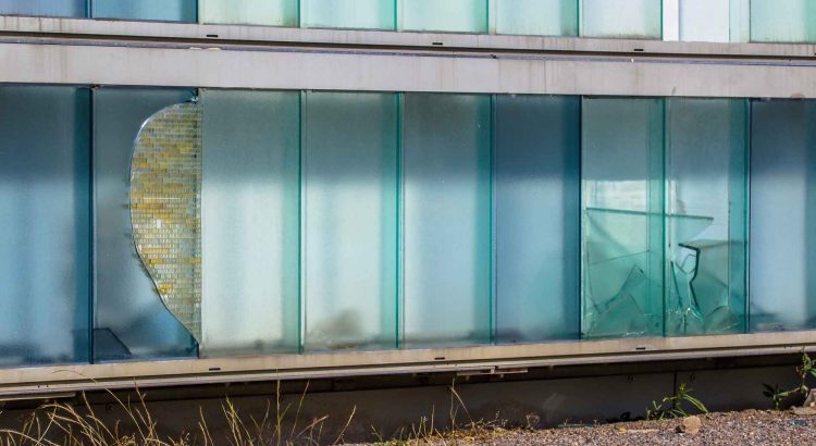
Adding a blaq’d take on the global project Dispatchwork originated by Jan Vormann. This project is authentic Street Art IMO compared to most so called Art in the Street Art and the Brick Art worlds. The open character adds to the greatness of this project as the people are equally ‘street’ as the concrete space.
If you feel compelled trying your hands on this I’d strongly encourage you. Make sure to submit your take to the project site.
[Best_Wordpress_Gallery id=”15″ gal_title=”Dispatchwork”]

Manufactured by the JiHud joint division of Jitsukawa Hudson Industries in Cyberabad.
The AC-47 is the robotic equivalent to the widespread AK-47. Mass produced, relieable and durable.
A tribute to the inspirational Weta Workshop Design Studio. Especially the concept art of District 9, Elysium (A poor film, but the sci-fi designs are ace) and Chappie have a remarkable grimy sci-fi style.
[Best_Wordpress_Gallery id=”14″ gal_title=”AC-47″]